Score two for flexible design
January 2, 2010
Pheromone Lab entitled “The Death of the Mobile Website”. The basic point of it was, as the landscape of web-ready devices become less segregated between “Desktop”, “Smartphones” and “Mobile”, and as we advance towards a more continuous ecosystem, we need to learn to design flexible interfaces that can adapt to a wide range of size, resolution, capabilities and modes of use
.
A few weeks ago, Apple, a leader in sales of mobile devices, apparently started contacting selected developers with one message: stop assuming that you are building applications for 320x480px screens.
Score one for flexible design.
So, how can one create applications that would feel and work great in the current fragmented market of web devices? I’ve had, for a long time now, a hunch that web standard technologies such as HTML and CSS had the answer. HTML and CSS were made to meet this challenge, to build interfaces that scale, to cascade differently according to the media. The new CSS3 Media Queries pushes this capability quite far already, and I have been looking forward to experimenting more with it.
I was surprised, however, by a very interesting new trend: HTML+CSS+JS are being used not as the final UI layer for web applications, but instead as a programming language to be compiled into other languages (such as objectiveC, Java etc.) and the deployed, with native UI look and feel, onto a variety of devices.
This is the strategy currently followed by Nitobi’s PhoneGap and Appcelerator’s Titanium, both of which allow development using the basic Web technologies and JavaScript API, and package the result into “native apps” for iPhone, Android (and blackberry).
This could be a very exciting development for web standards as base layers for everything on the web… including applications that have very little to do with the Web paradigm. And for designers and developers, this could be the solution to the conundrum of flexible design and multi-platform development.
Score two for flexible design.
Previous/Next
Derniers mois à Setagaya
2009-02-22

2006 ~ 2008. Un an exactement après avoir quitté Tokyo, je reviens sur mes souvenirs d'une ville où j'avais planté mes racines.
Barcelone
2010-04-04
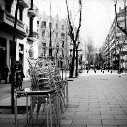
Quelques jours à visiter tant de quartiers de Barça que l'on finit par se dire qu'après tout, on pourrait y vivre.